
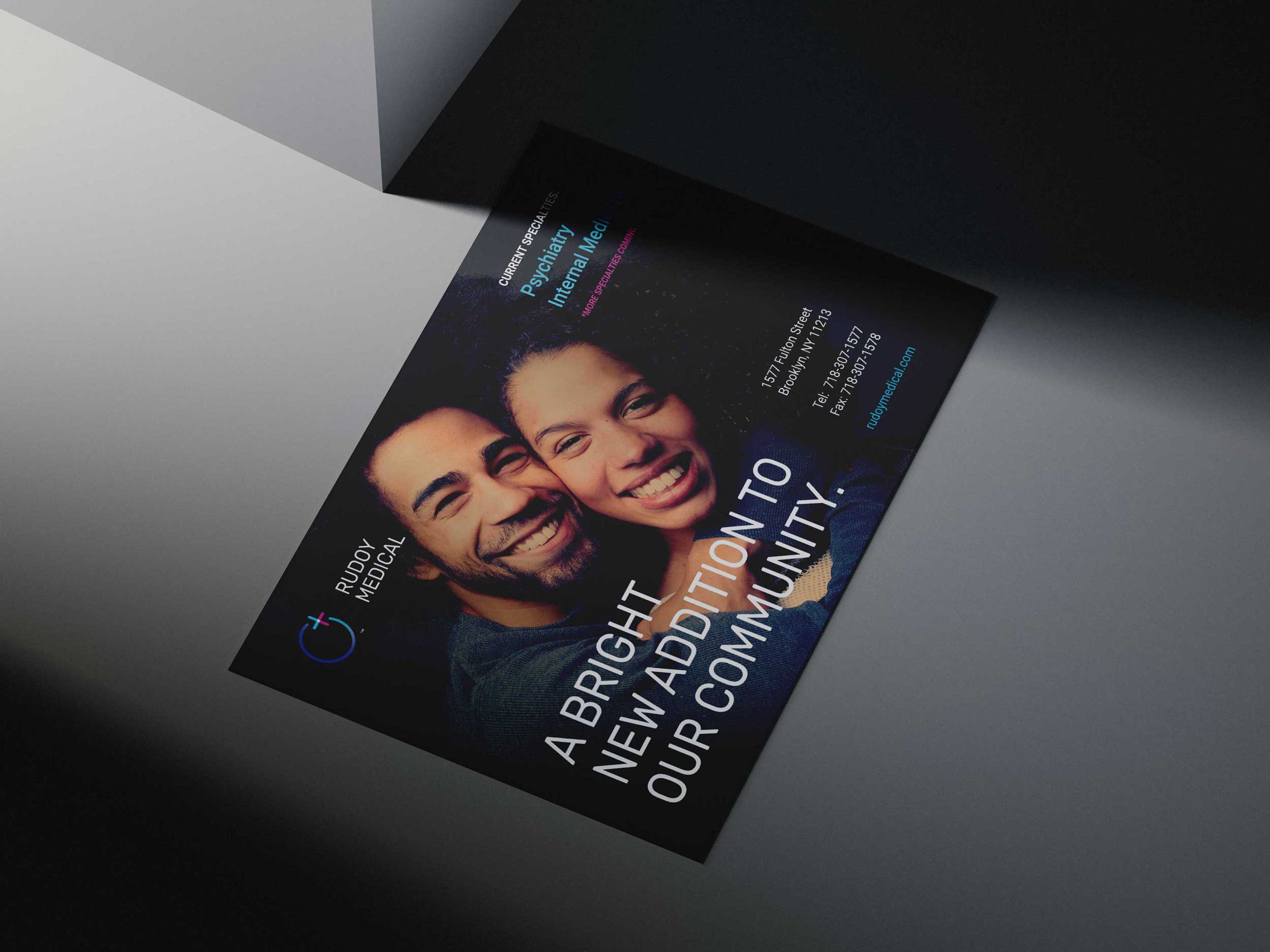
Rudoy Medical
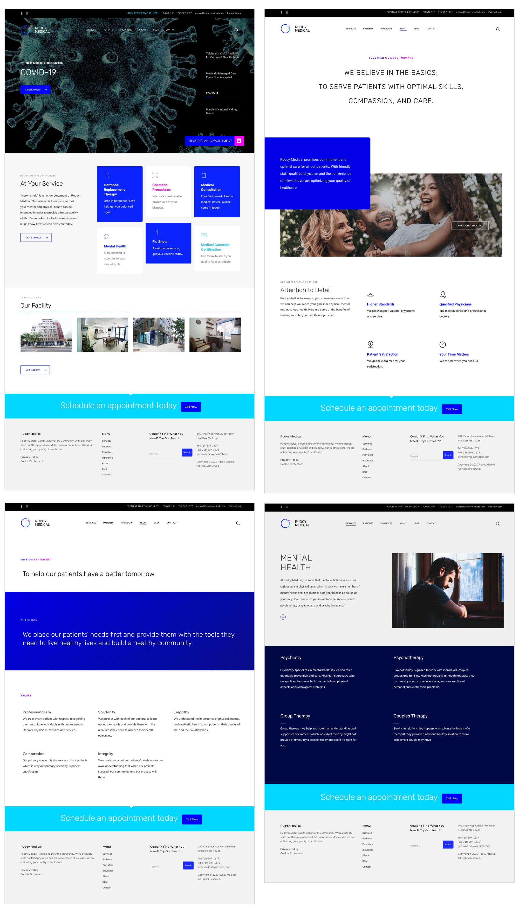
Rudoy Medical is a patient-centered healthcare practice combining clinical expertise with accessible, modern care. With a multidisciplinary team and the option of televisits, the practice aims to remove friction from the healthcare experience while maintaining a high standard of treatment. As the practice evolved, there was a need for a brand identity that reflected this balance of professionalism, empathy, and innovation.
Our work began by defining how Rudoy Medical should be positioned in a competitive healthcare landscape. The objective was to create a brand presence that felt credible and contemporary, while remaining approachable and reassuring for patients.
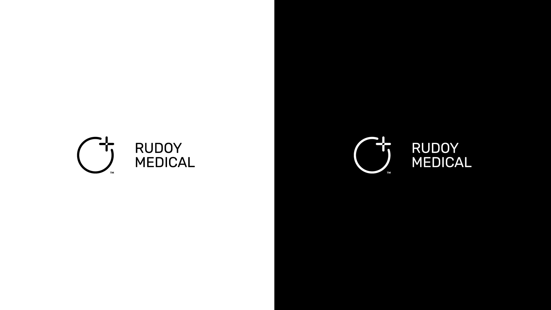
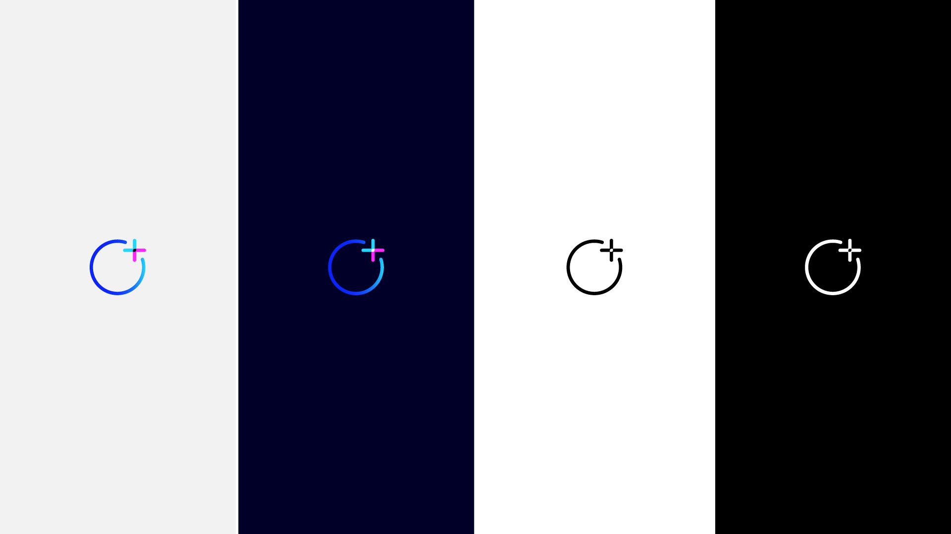
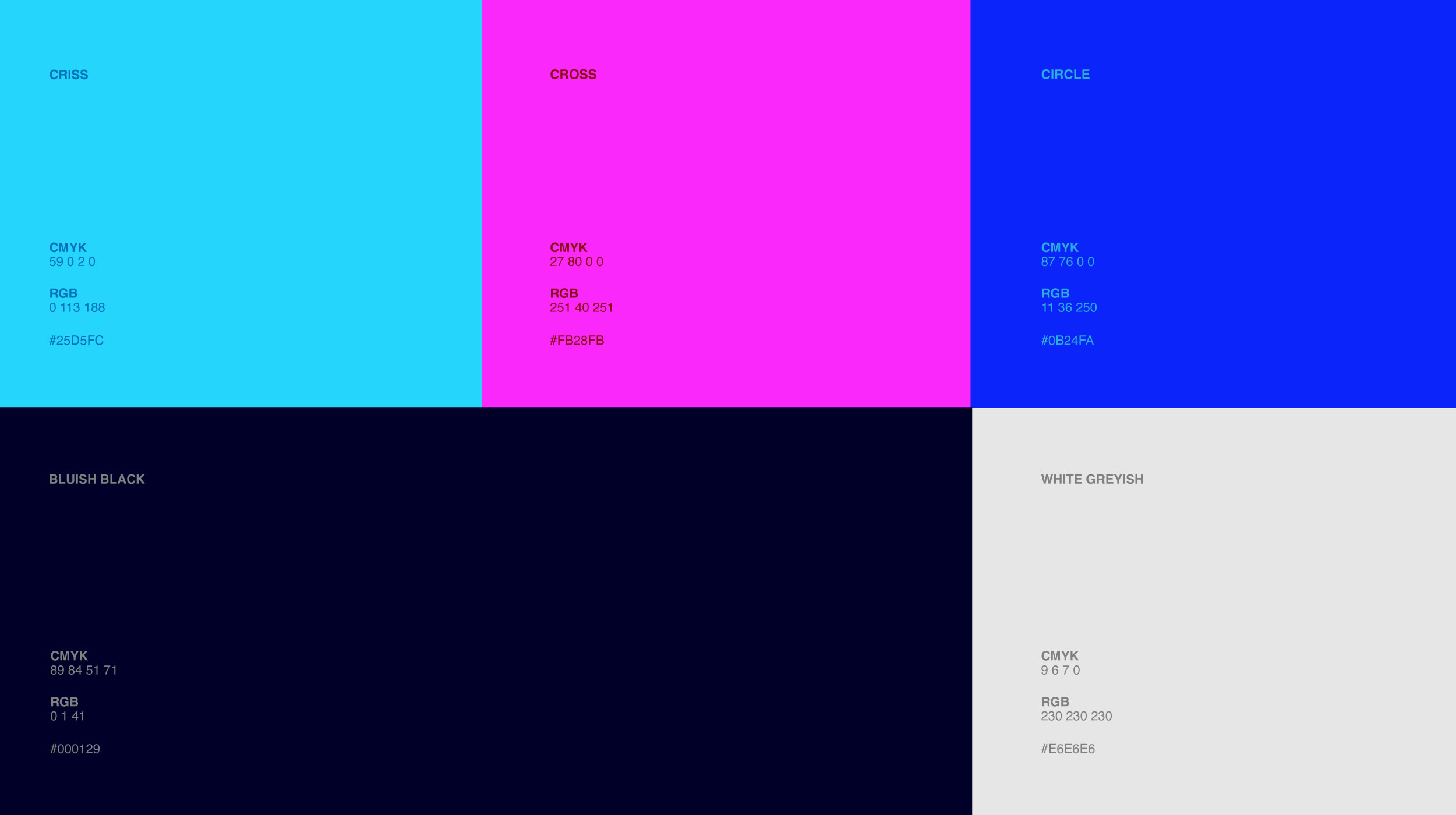
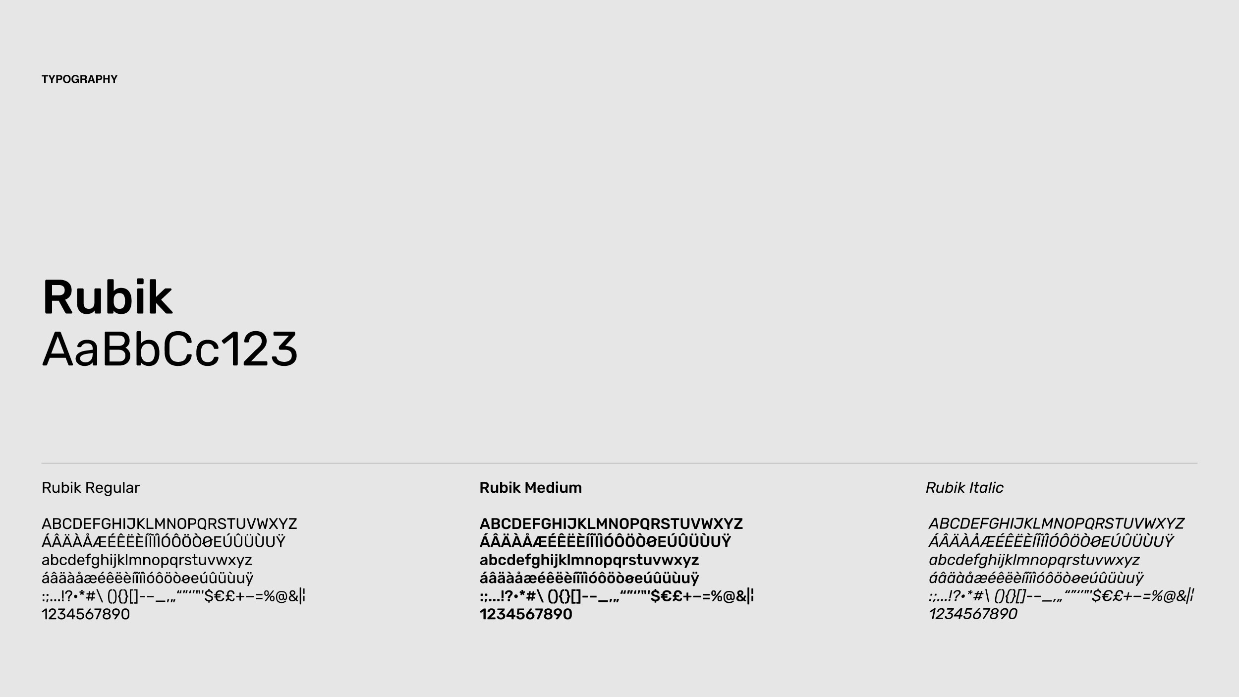
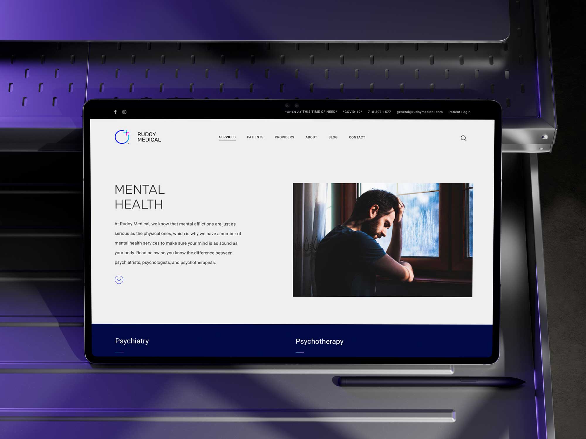
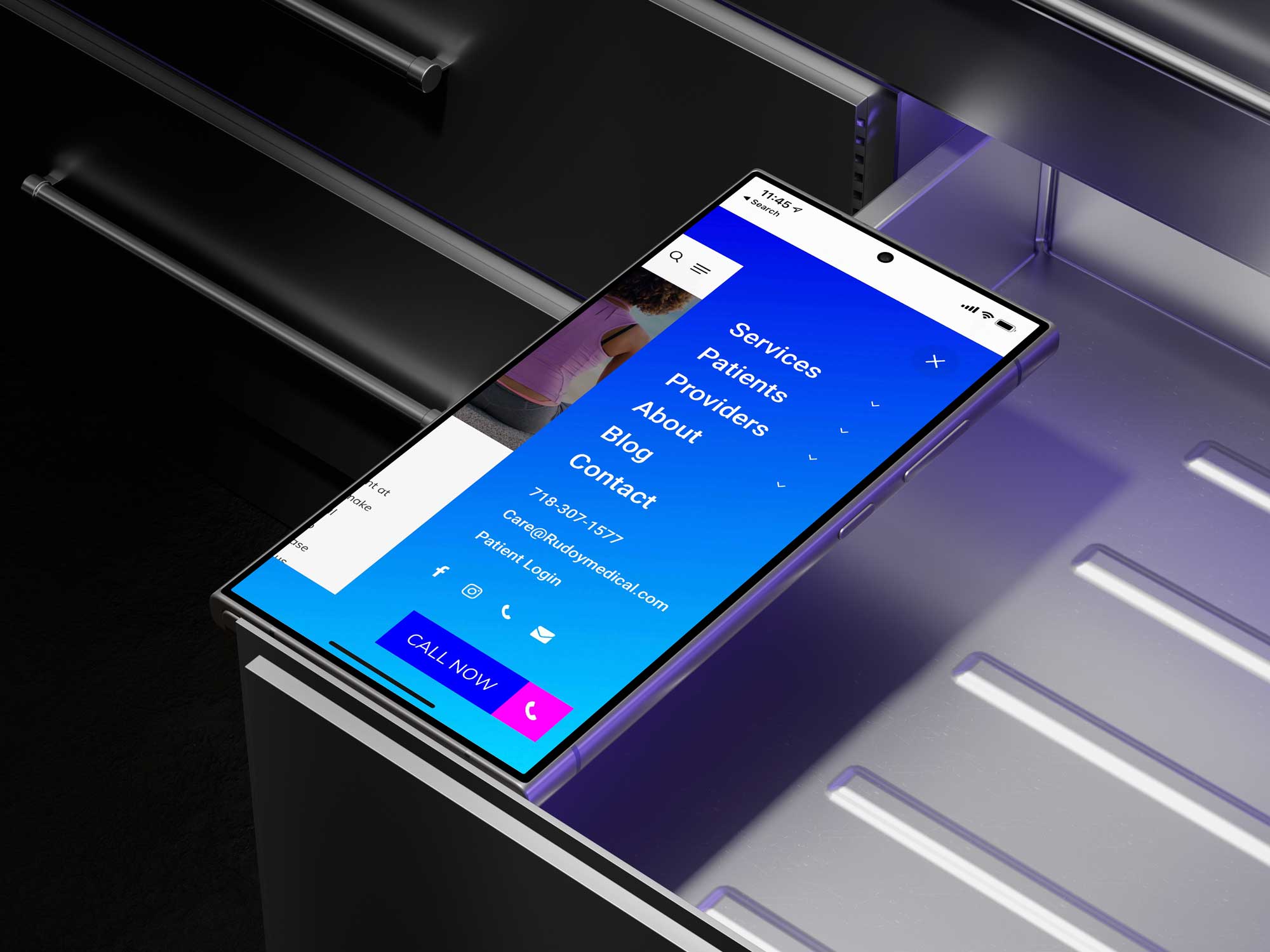
We developed a corporate identity grounded in a clear visual system, anchored by the circle as a central symbol. Chosen to represent continuity, care, and life, this element became the foundation for a cohesive visual language that supports the practice’s holistic philosophy. The identity was designed to feel consistent and dependable across every patient interaction.
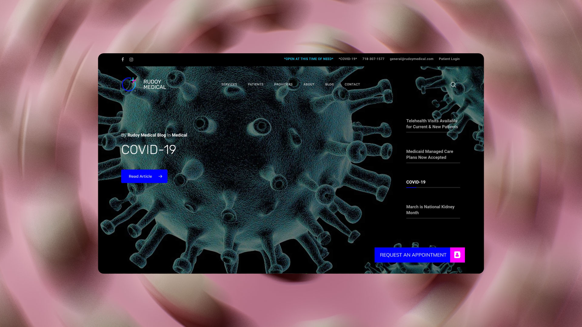
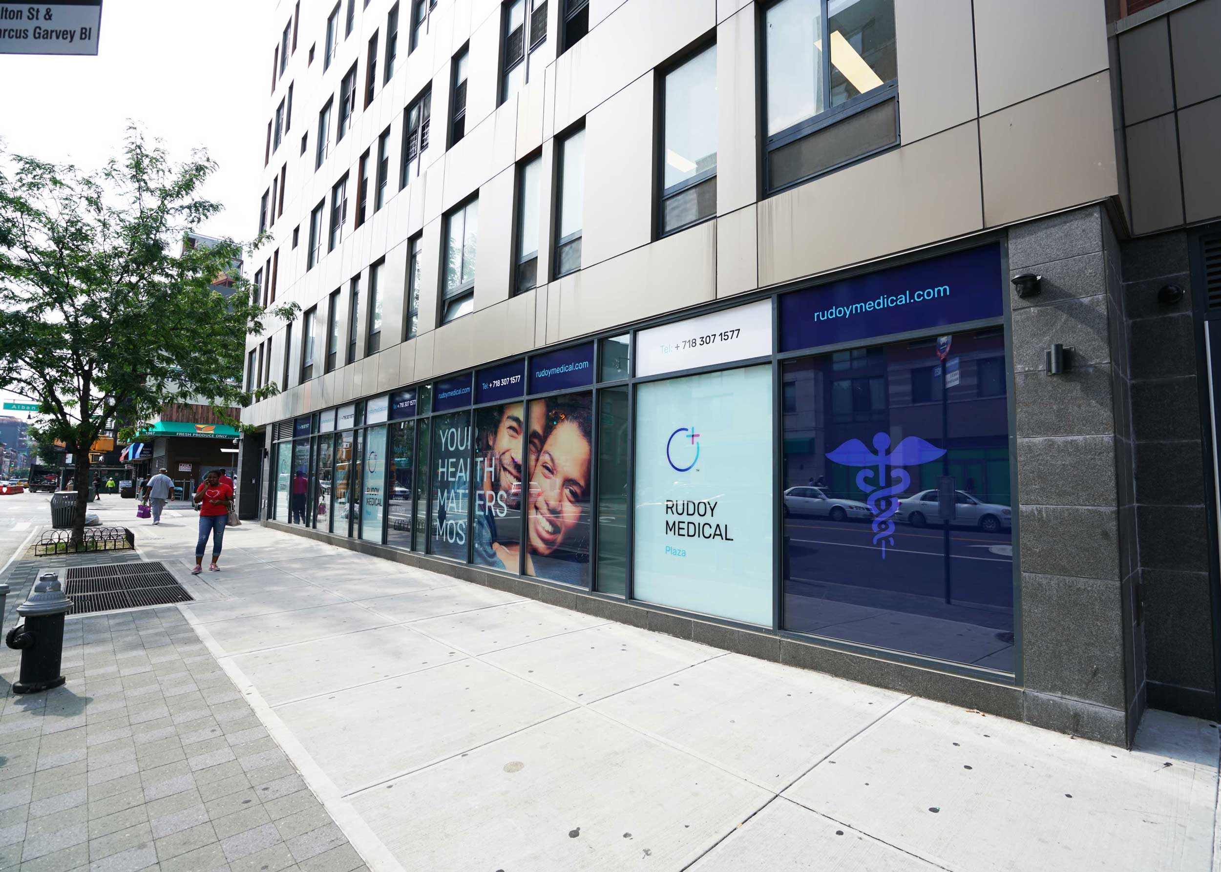
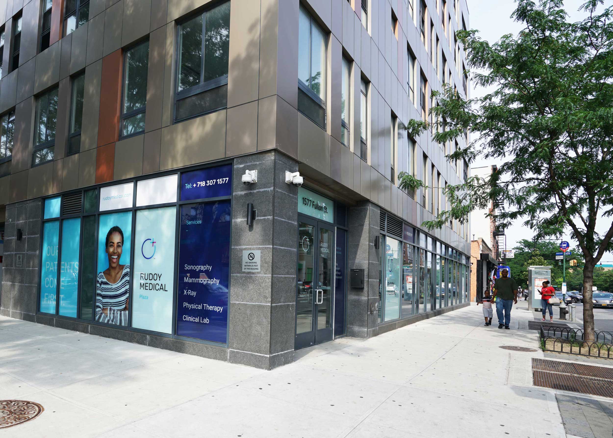
The brand system was then applied across physical locations and communication materials, including calls to action and messaging focused on positive outcomes and patient empowerment. The result is a modern, human-centered brand that builds trust, encourages engagement, and aligns Rudoy Medical’s visual presence with its commitment to accessible, compassionate care.


Related WORK
SIGO New York
BRAND STUDIO
